Flexbox
CSS Flexbox layout - technologies for placing blocks on an HTML page
Flexbox is designed to optimize the layout of elements, unlike float. It facilitates alignment of elements horizontally and vertically, change of direction and order of display of elements, allows to stretch blocks on all height of the parent or lower them to the bottom edge.
What is Flexbox?
Flexbox is useful tool for solving some CSS problems (for example vertical alignment).
Flexbox is needed to make the layers convenient for developer and to work with them in the simplest way. The purpose of flexible markup is to allow the container to change the width / height (and order) of its elements to fill the space available (mainly to accommodate all types and sizes of screens).
Flexbox is a full-fledged module, not a separate property, it contains a whole set of properties. Some items are designed to work with the parent container "flex container". And others relate to child elements (flex elements).
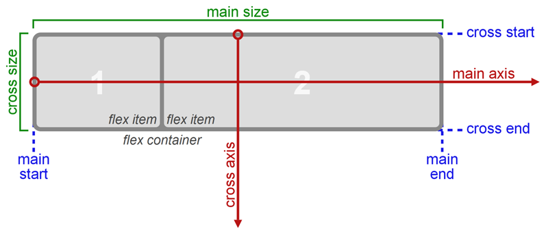
The conventional layout system is based on block and line directions, however Flexbox is based on flex-flow directions.
Let's create flex-container
<divclass="flex-container"> |
.flex-container { |
Flex-direction
There are two axes: main axis and the perpendicular to it.
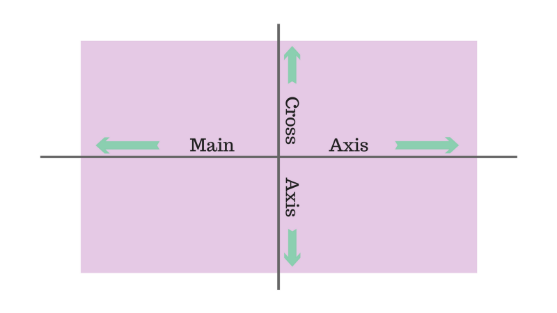
By default, all objects are located along the main axis: left to right. display: flex property; makes blocks aligned
The flex-direction property allows you to rotate the main axis.
There are several options for flex-direction: row-reverse and column-reverse.
.flex-container { |
Justify-сontent, align-items
It can have 5 values.
- flex-start
- flex-end
- center
- space-between
- space-around
justify-сontent works with main axis and align-items works with axis perpendicular to main.
Align-items can also have 5 values:
- flex-start
- flex-end
- center
- stretch
- baseline
.flex-container { |
Flex-grow
It determines the ability of the element to increase in size if necessary. It takes a dimensionless value as a proportion, which determines how much free space an element should occupy inside a container.
If all elements have the flex-grow property set to 1, then the free space inside the container will be evenly distributed between all elements. If one of the elements has a value of 2, then the element will take up twice as much space as the rest (at least it will try).
Negative numbers cannot be defined.
.box-1 { |
Flex-shrink
Determines the ability of the element to decrease size, if necessary.
Negative numbers cannot be defined. By default it is 1.
Flex
This is a shorthand for flex-grow, flex-shrink, and flex-basis. The parameters flex-shrink and flex-basis are optional. The default value is set to 0 1. It is recommended to use shorthand property rather than specifying values individually.
Pros of Flex
- You do not require grids of different HTML frameworks
- Clear and flexiblecontrol of the blocks
- Solved problem of vertical positioning
- Support of all modern browsers except Internet Explorer.
Cons of Flex
- Unable to use under Internet Explorer 9.
- Internet Explorer 10+ does not understand some of the Flexbox terms.